Research
To improve user experience, it was crucial to pinpoint the limitations of the old system, first globally and then within each module. To this end, I conducted extensive research on the existing EHR interface and interviewed the medical staff to map out their work processes and identify pain points. To identify best practices in user workflows, I also carried out a competitive audit.
Analysis
In cooperation with a team of analysts, we collected information on the legacy software: how it works, what it’s capable of doing and how users interact with it. After a thorough analysis of its visual architecture, we identified many areas for improvement.
Ideation
Based on the insights gathered during analysis, I set out to create a selection of concepts, each with a different visual architecture and style, for the client to choose from.
Design
In line with the preferred concept of the client, I proceeded to create a pilot version of the first module, as well as a UI kit to serve as a fundament for future design systems throughout this project.
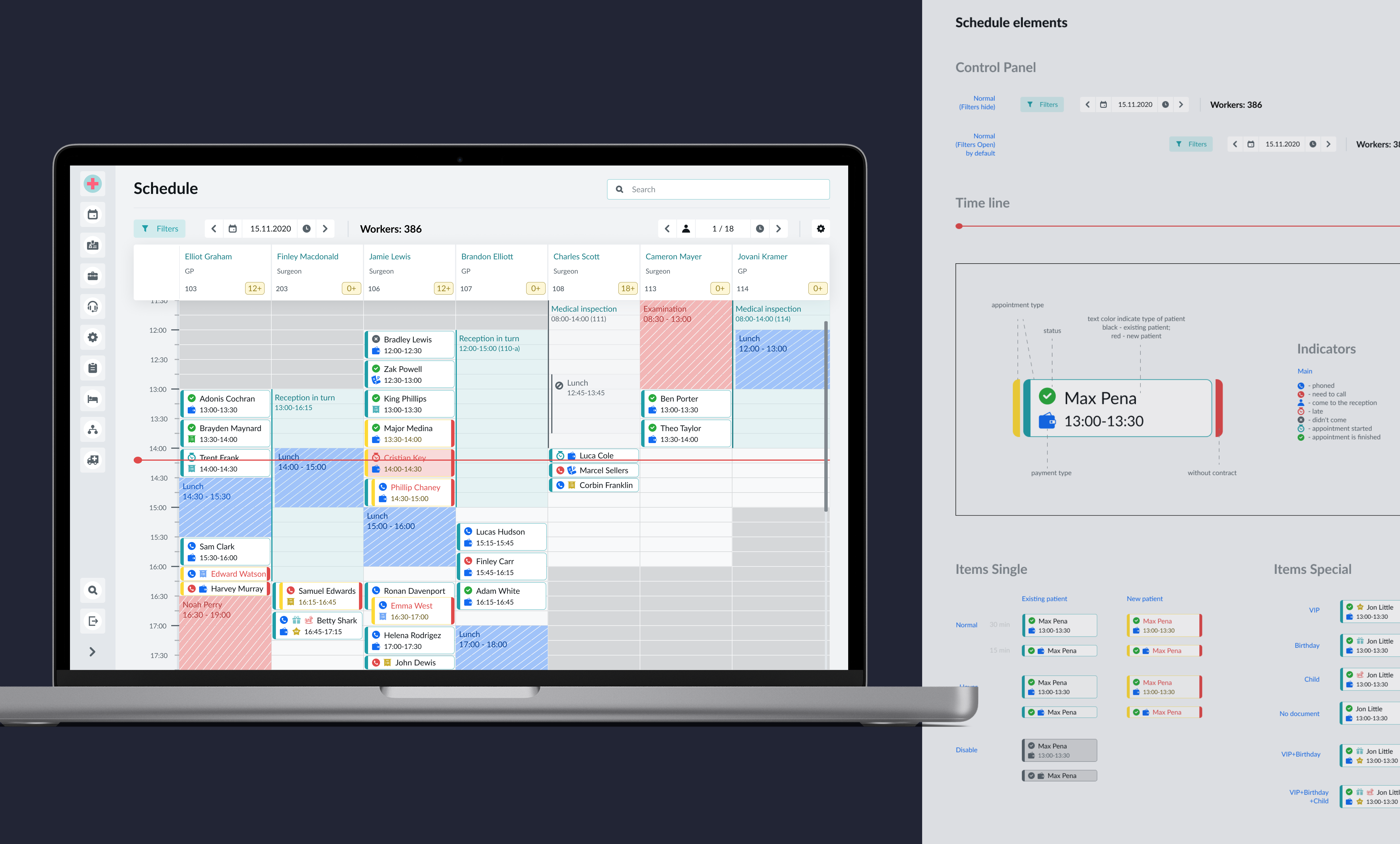
UI elements

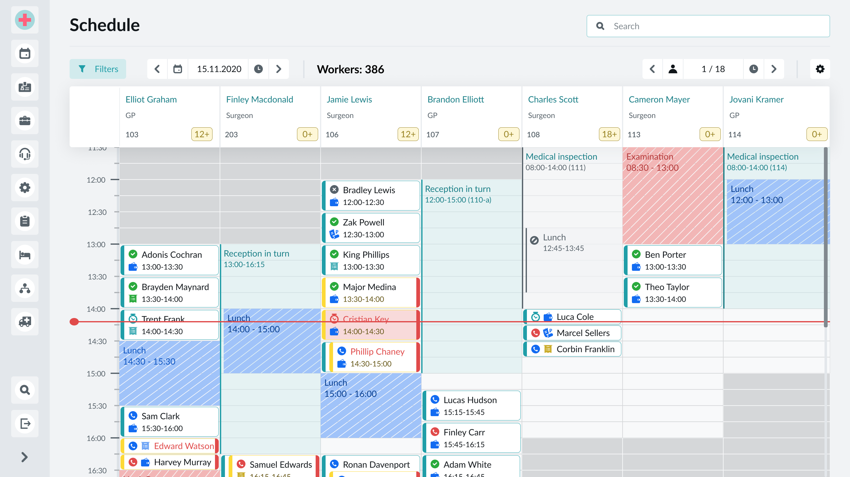
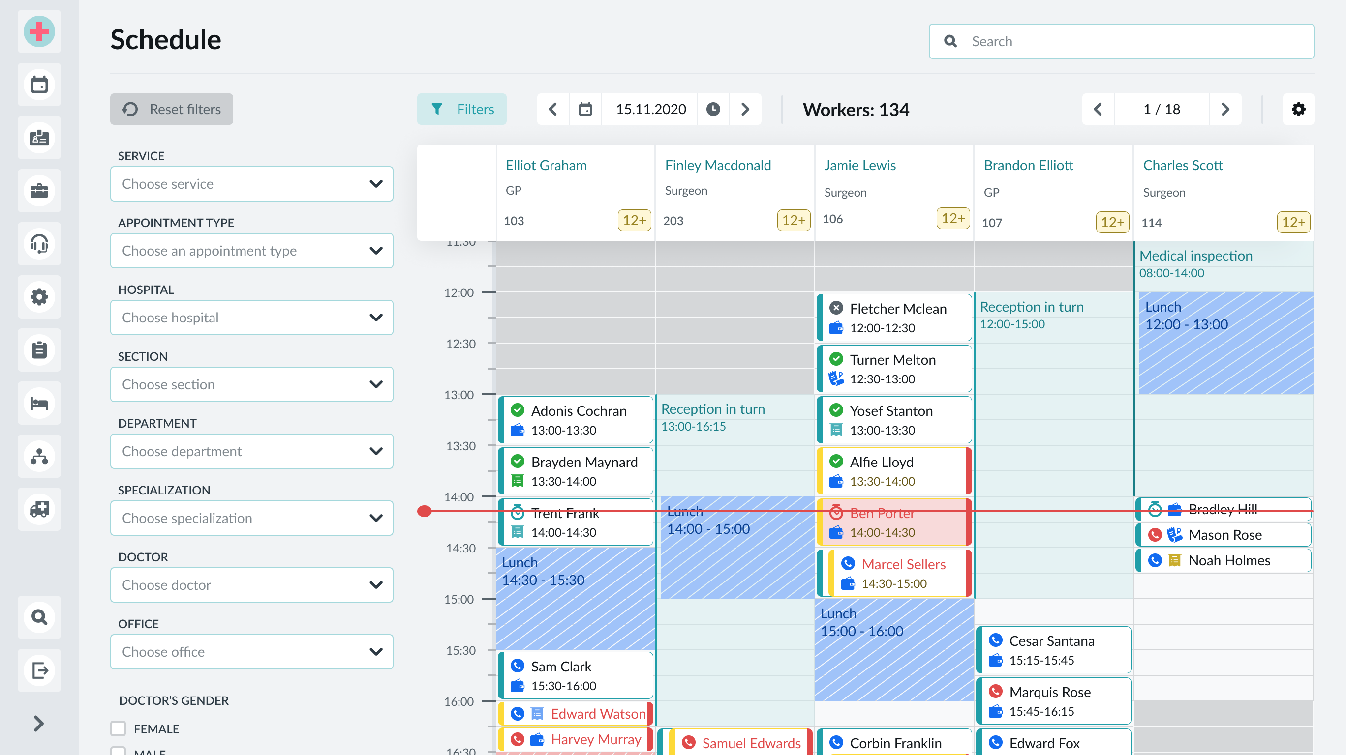
Schedule interface
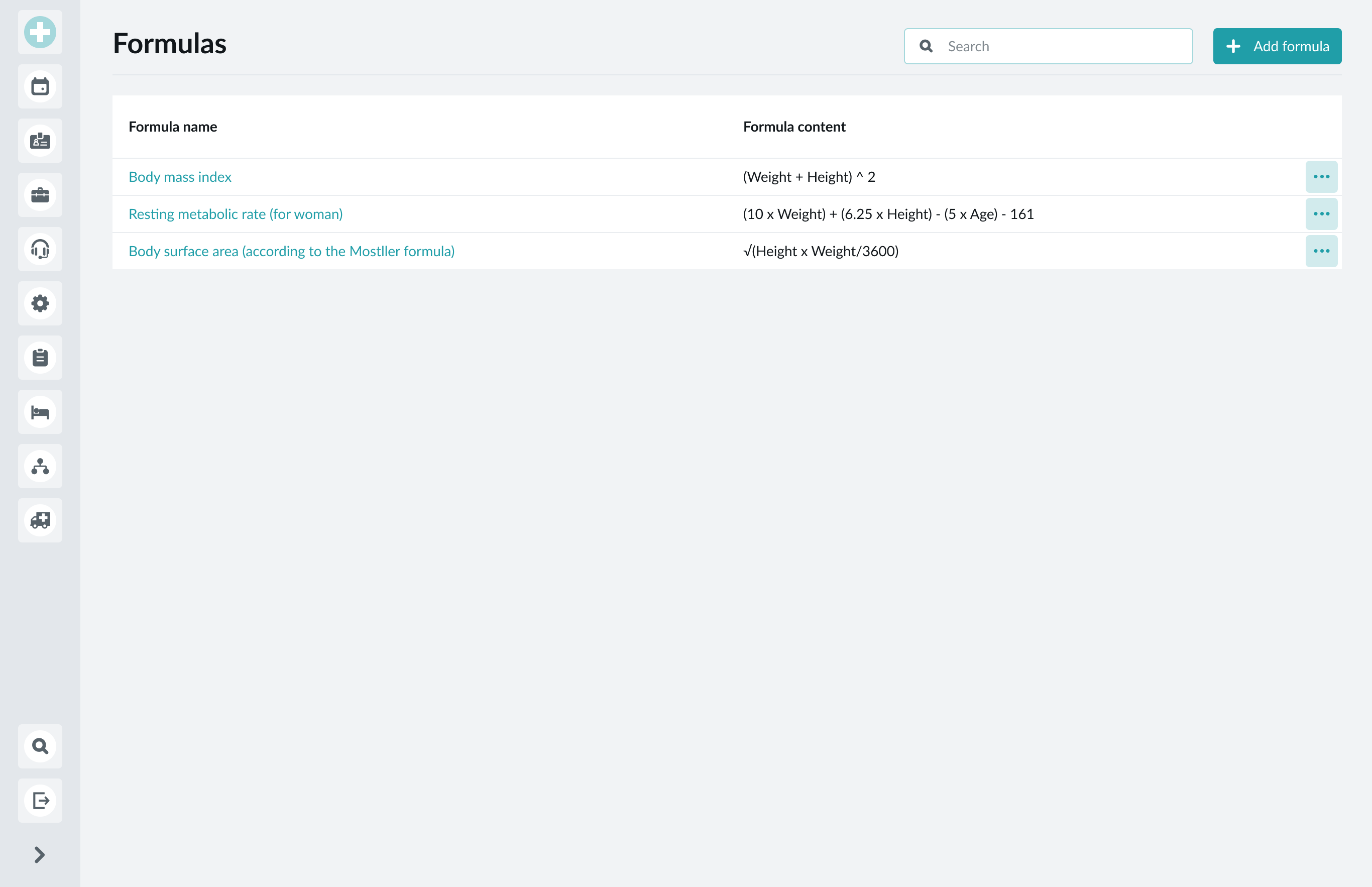
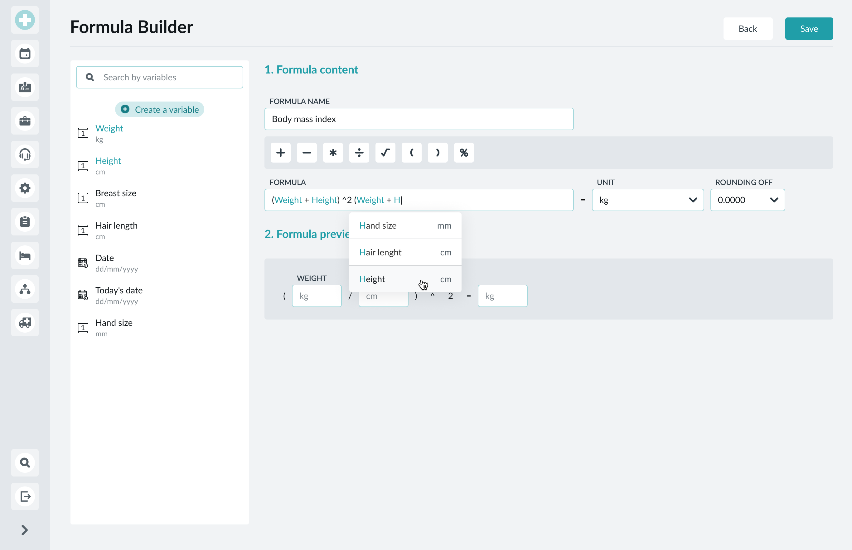
Formula builder
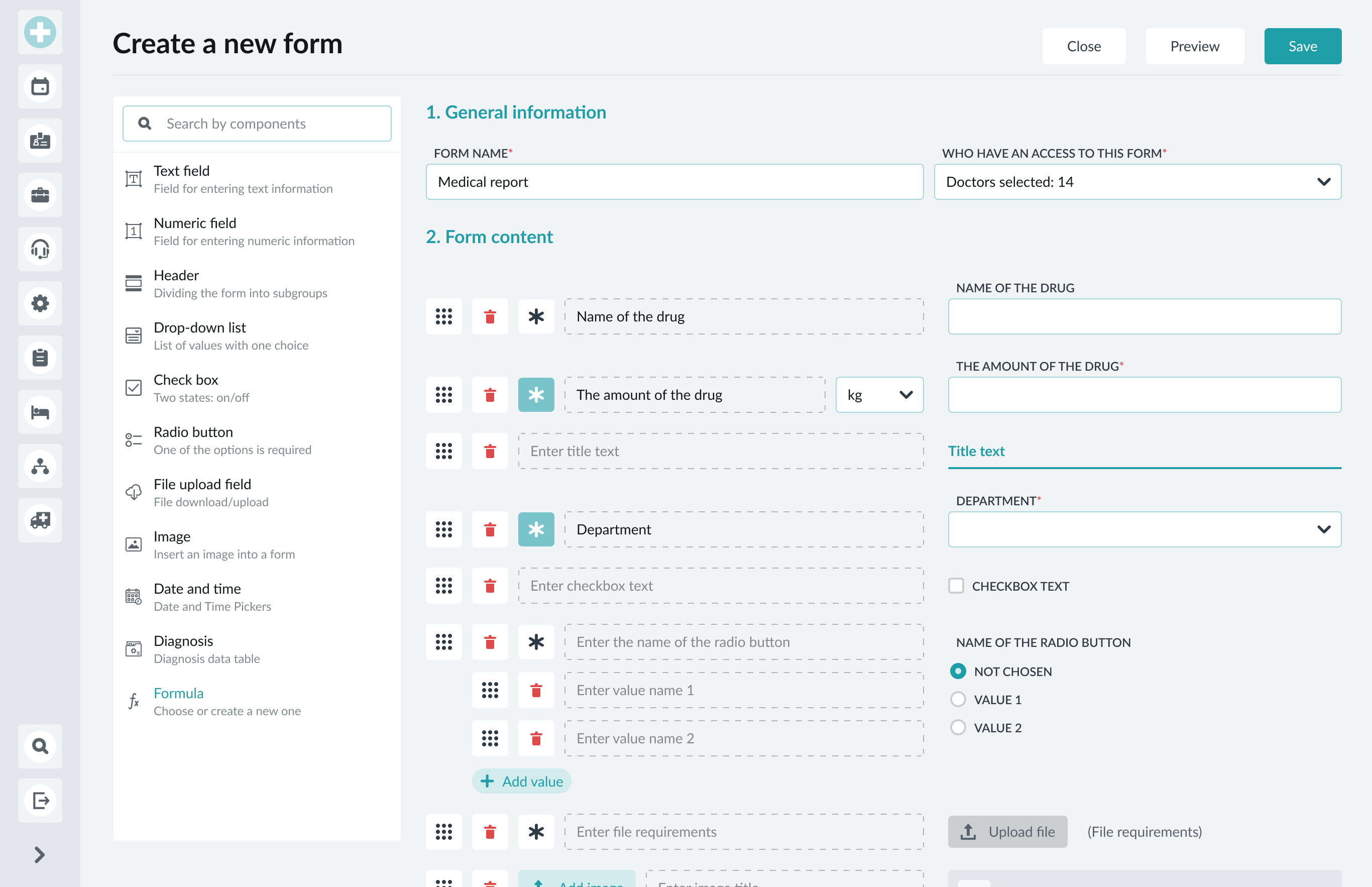
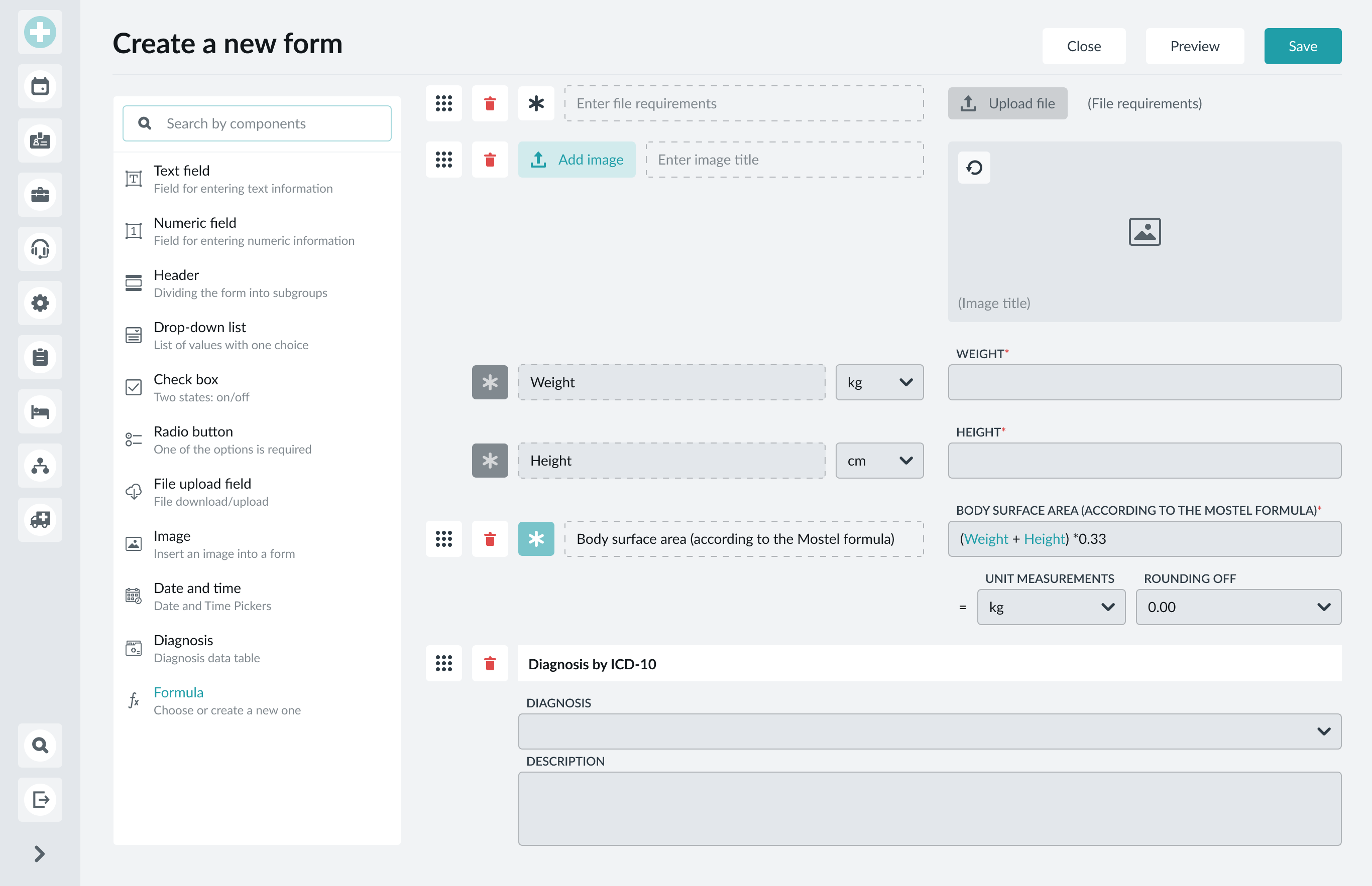
Form builder
Feedback
The stakeholder review of the first module was essential: their feedback prompted us to tweak some aspects of the visual architecture and overall style for improved readability for the end users. It was also the occasion for us to present a clear timeline regarding software and to agree with the client on the expected results.
Iterations
Having received the greenlight from the client on all deliverables, I proceeded to build the software module by module to ensure a seamless data transition from their legacy system. For each module, I followed the design process described above.