
Design of RIS software
Radiology information system with user-friendly interface
Client
Software company
Role
Product Designer / UX Designer
Tools
Figma
Timeframe
8 weeks
Mission
`Making an easy-to-use Radiology information system that includes all necessary functions from the first release.
Objective
The client came to me as their existing software lacked functionality and was hard to use: their hospital staff lost a lot of time and made mistakes due to it. The objective is to create new easy-to-use software that would include all the functions required to carry out all daily tasks.
Approach and deliverables
I created a working product from scratch. For the first release, I paid close attention to two main functions of the system: the worklist and the radiology report.
Process:
Research
Context study. User pain points. Competitive audit.
Analysis
Problem statement. Use cases. Executive summary.
Ideation
Design principles. UX journey mapping.
Design
Low and high fidelity wireframes. Interactive prototypes.
Feedback
Stakeholder reviews. Field testing.
Iterations
Iterations. Detail fixing and copywriting. Documentation and file prepping.
Research
The end-users were clearly defined: my task was to create a software to be used in cancer treatment centres or departments by doctors, nurses and administrators. The project was created during COVID: I couldn’t physically visit the hospital for research purposes but I managed to interview doctors online between their shifts. Due to the medical nature of the work, this task required a global approach taking into consideration the needs of the hospital staff and the patients, as well as the existing process in place for radiology: I carried out ample research to identify the functions and limitations of the medical equipment to integrate. I noticed that RIS was used by two types of users - the laboratory assistants who create and manage cases, and the doctors who write the medical reports.
Analysis
Problem statement
Doctors need easy access to all patient information during the report description to offer optimal care.Administrators need a clear understanding of each patient situation for easy management.
Executive summary
The biggest problem with the legacy RIS software was its complexity, as it was created in the 1990s - a time when UX design was not even a profession. The client was also weary to change as new software could prove costly and lengthy to develop. With this in mind, my main goal was to create easy-to-use software that anyone can use without any technical knowledge.
Ideation
Design principles
Easy to use. Software must accelerate processes, not slow them down. Doctors and medical workers have a very big responsibility and their time is precious.
Readability. Software must be clear. Users should be able to follow their progress easily, see what tasks they’ve completed and what needs to be done next in one glance.
Access to information. Software must give the users all the information they need to be more productive. To help the medical staff, useful data should be readily accessible and not stored away.
Design
I faced various limitations on the backend side, which sometimes required new design solutions to overcome. This software had to become an embedded part of an already working machine.
Wireframes


Through my research I realised that the vast majority of old-school RIS systems use a dark interface, the reason being that radiologists used to work with images that required complete darkness. But thanks to technological advances in digital imagery, staff now work in bright lighting. I decided to create both dark and light themes to give each user a choice: they could keep the dark version or switch to a light theme for consistency with the other software they use.
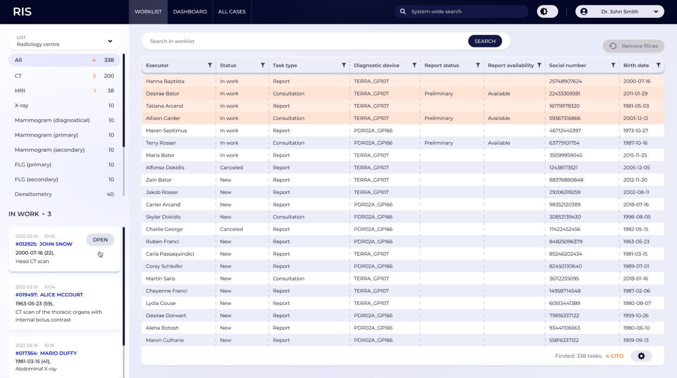
WorkList
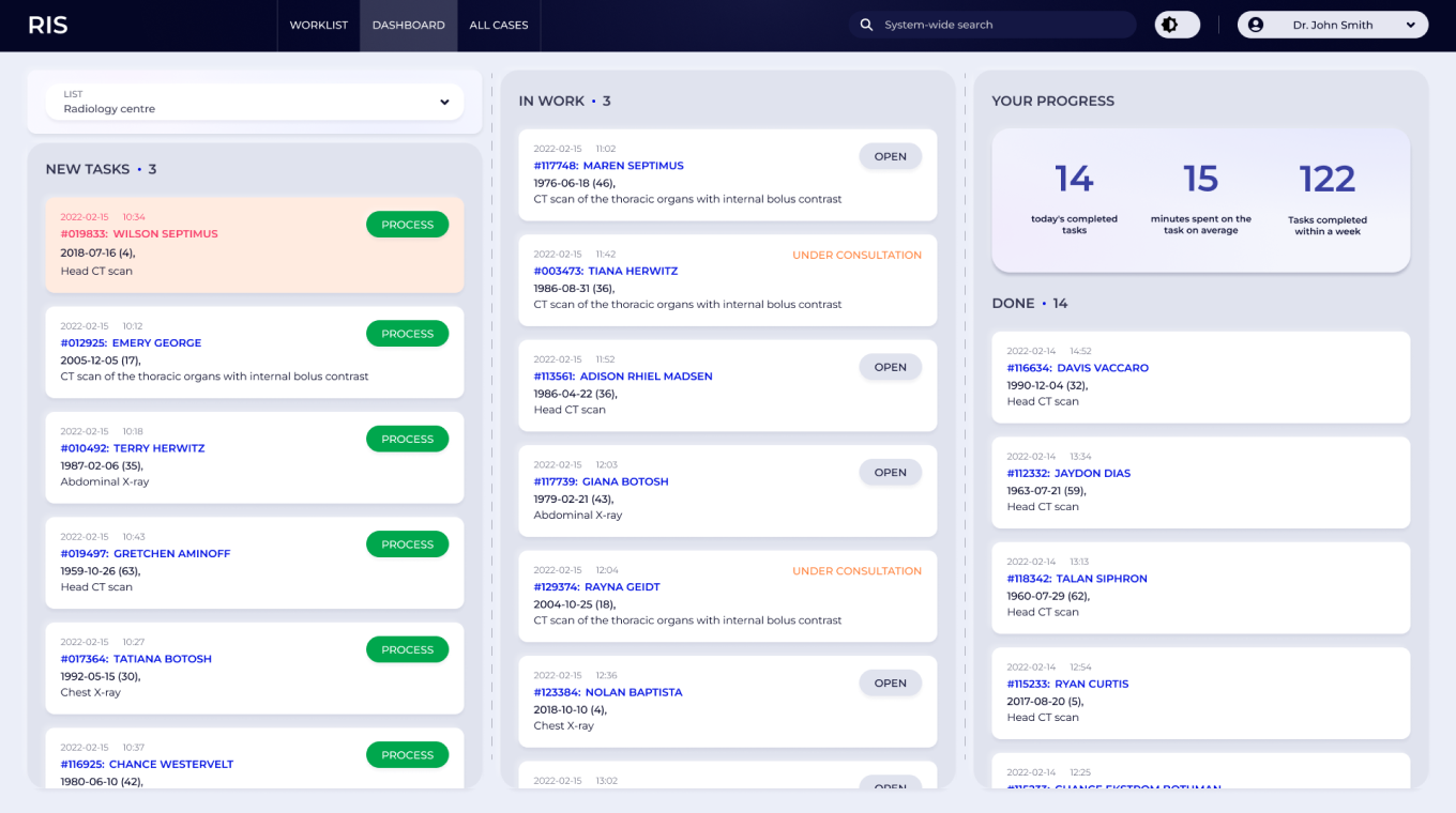
Dashboard
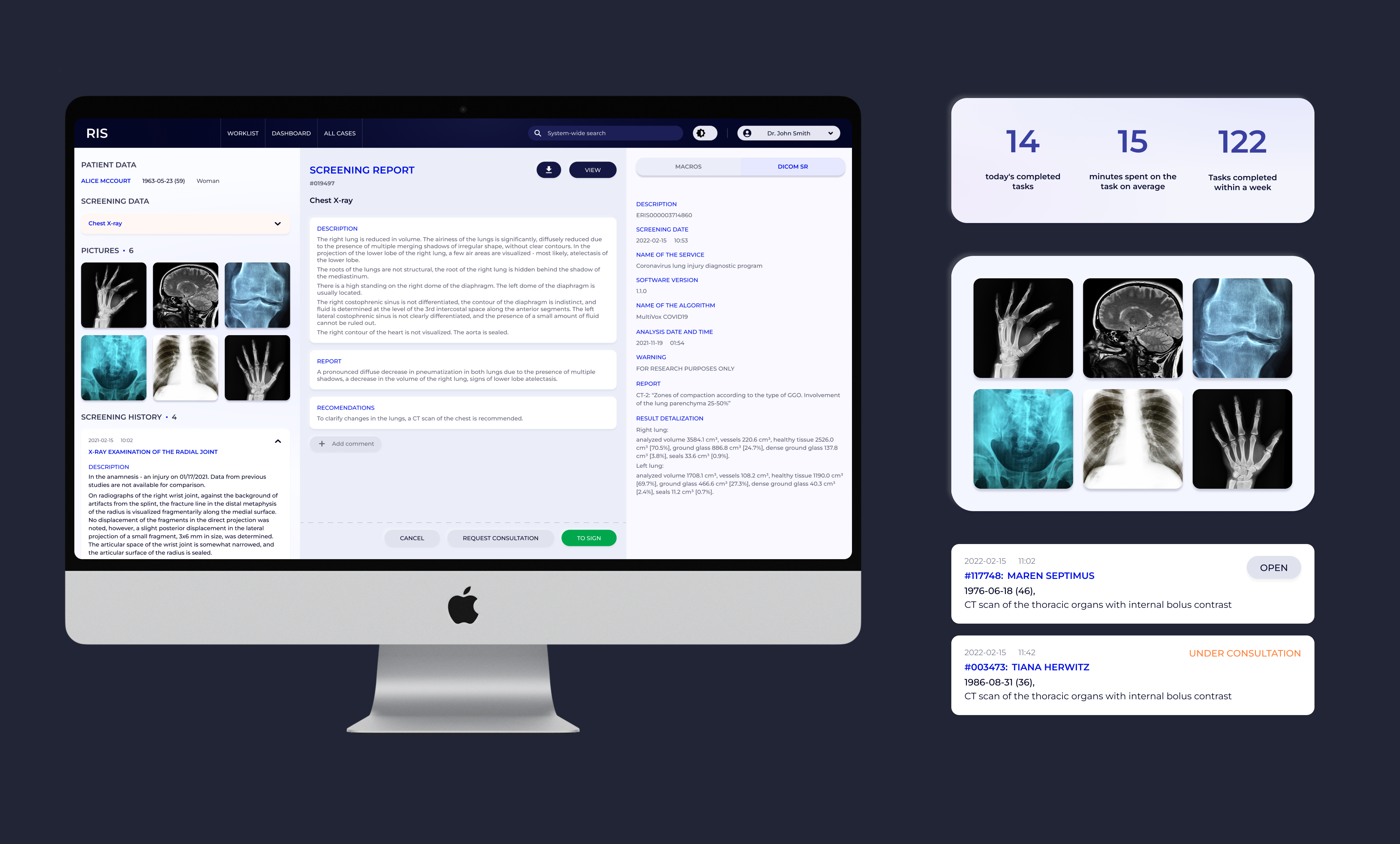
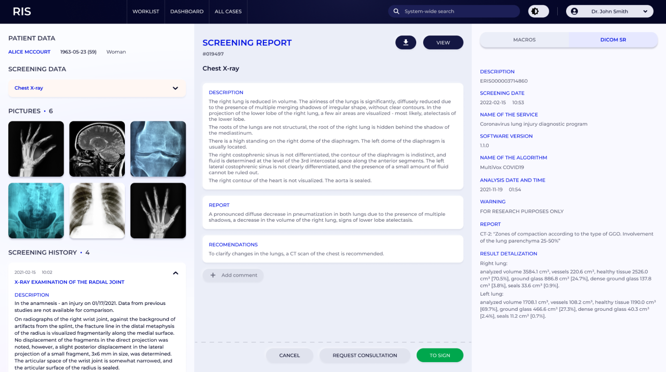
Screening report
All cases data

Feedback
At first, the stakeholders were hesitant as they did not believe that RIS software could be easy to use. Hospital staff were worried that they would end up with a system just as complicated, but updated with new colours. But when testing the software in-house, the feedback from real users was very positive. But the most exciting part - the launch - was yet to come.
Iterations
I organised a pilot launch in one chosen hospital, the goal being to identify all potential problems, fix them on the spot and then deploy this new solution to all health facilities. The staff was prepared beforehand for this transition and the implementation took only one day. The results exceeded all expectations. The users intuitively knew where to go to carry out each task as the software was built with their needs in mind.